
Garden Colour Theory · 2026
Colour Theory for Garden Design: The Complete 2026 Guide
Colour theory for garden design is the practice of choosing and arranging plant and material colours using the same colour-wheel logic interior designers use indoors, so a border reads as considered rather than random. The two moves that matter most: pick one dominant colour family and repeat it, and use warm colours to make a space feel closer while cool colours make it feel farther away. This guide explains the colour wheel in plain English, gives five ready-to-copy planting colour schemes with real plant pairings, and shows how to test a palette on your own garden before buying a single plant.
AI Garden Design GuidesPublished July 9, 2026Updated July 9, 202610 min read
The one-line answer
None of this requires an art degree. Three ideas cover almost every decision worth making: which colours sit near each other on the wheel, whether a colour is warm or cool, and how many times a colour repeats across the space.
What is colour theory in garden design?
Colour theory for garden design borrows directly from the colour wheel used in art and interiors: three primary colours — red, blue and yellow — combine to make three secondary colours, orange, green and purple. Every planting colour scheme is really a decision about which of those colours to use, how light or dark a version of them (their value), and how bright or muted (their intensity), according to the University of Georgia Extension's guide to landscape colour theory.
Adding white to a colour makes a paler tint; adding black makes a darker shade; adding grey makes a softer tone. A border of pale pink, dusky rose and deep maroon is really one colour — red — used at three different values, which is why it reads as calm and coordinated rather than three unrelated colours. For the wider design principles that colour sits alongside — balance, scale, rhythm and focal points — see our guide to interior design principles for the garden.
Warm colours vs cool colours: how they change the feel of a garden
Red, orange and yellow are warm colours, associated with heat, fire and energy; they demand attention and feel closer than they actually are. Blue and green are cool colours, associated with water, sky and forest, and tend to feel calm and recede into the distance. Purple sits in between and can read as either, depending on what grows next to it — near blue, it reads cool; near red, it reads warm.
This is not just decoration. Because warm colours visually advance and cool colours visually recede, planting cool colours — blue, white, silver, pale green — at the far end of a small garden makes the space feel deeper than it is. The same trick works in reverse on a very long, narrow plot: a hot border of warm colours near the house can make the space feel more intimate and less like a corridor.
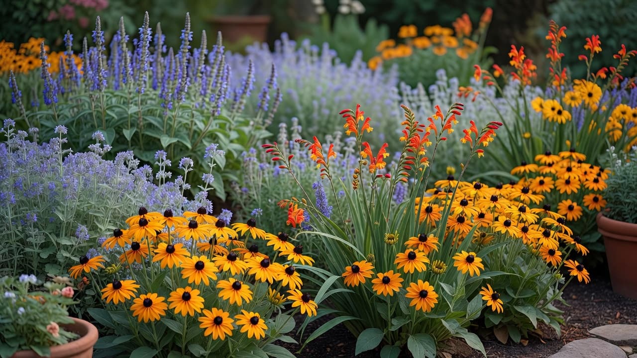
- Rudbeckia fulgida ‘Goldsturm’ — gold daisy flowers from midsummer into autumn.
- Crocosmia ‘Lucifer’ — arching sprays of scarlet, flowering July–August.
- Dahlia ‘Bishop of Llandaff’ — near-black foliage with vivid red flowers.
- Helenium ‘Moerheim Beauty’ — copper-red, late-summer daisy flowers.
- Salvia nemorosa ‘Caradonna’ — deep violet-blue flower spikes, early summer.
- Nepeta ‘Six Hills Giant’ — a lavender-blue haze, repeat-flowering if cut back.
- Agapanthus — blue or white flower globes in late summer.
- Echinops ritro (globe thistle) — steel-blue, spherical flowerheads.
Five planting colour schemes to copy (with real plant pairings)
Most successful borders use one of a handful of proven colour schemes, each pulled straight from the colour wheel:
- Monochromatic — one colour at different values. Sissinghurst Castle Garden's famous White Garden, created by Vita Sackville-West, restricts planting to white, cream, silver and grey — try white Cosmos, white Agapanthus and silver-leaved Stachys byzantina.
- Analogous — colours that sit next to each other on the wheel. A hot border of Rudbeckia (yellow), Crocosmia (orange) and Helenium (red-orange) reads as one warm family even though it uses three different flowers.
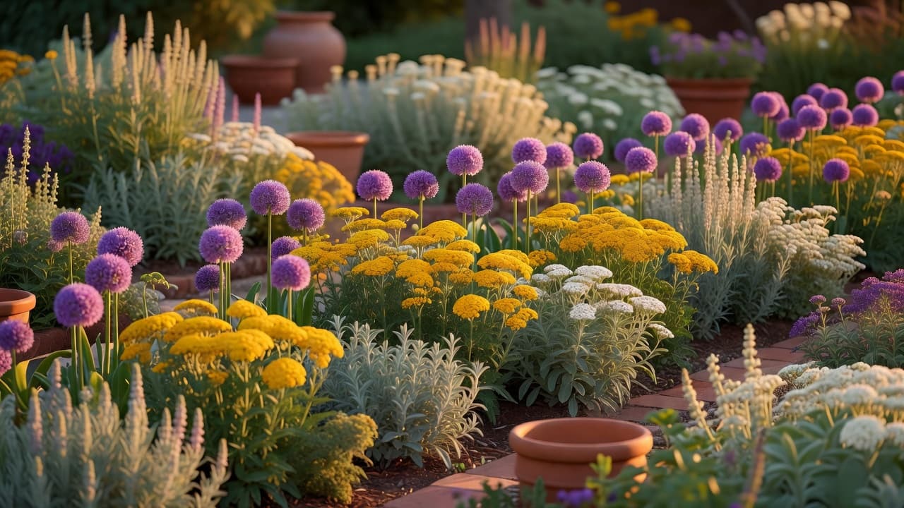
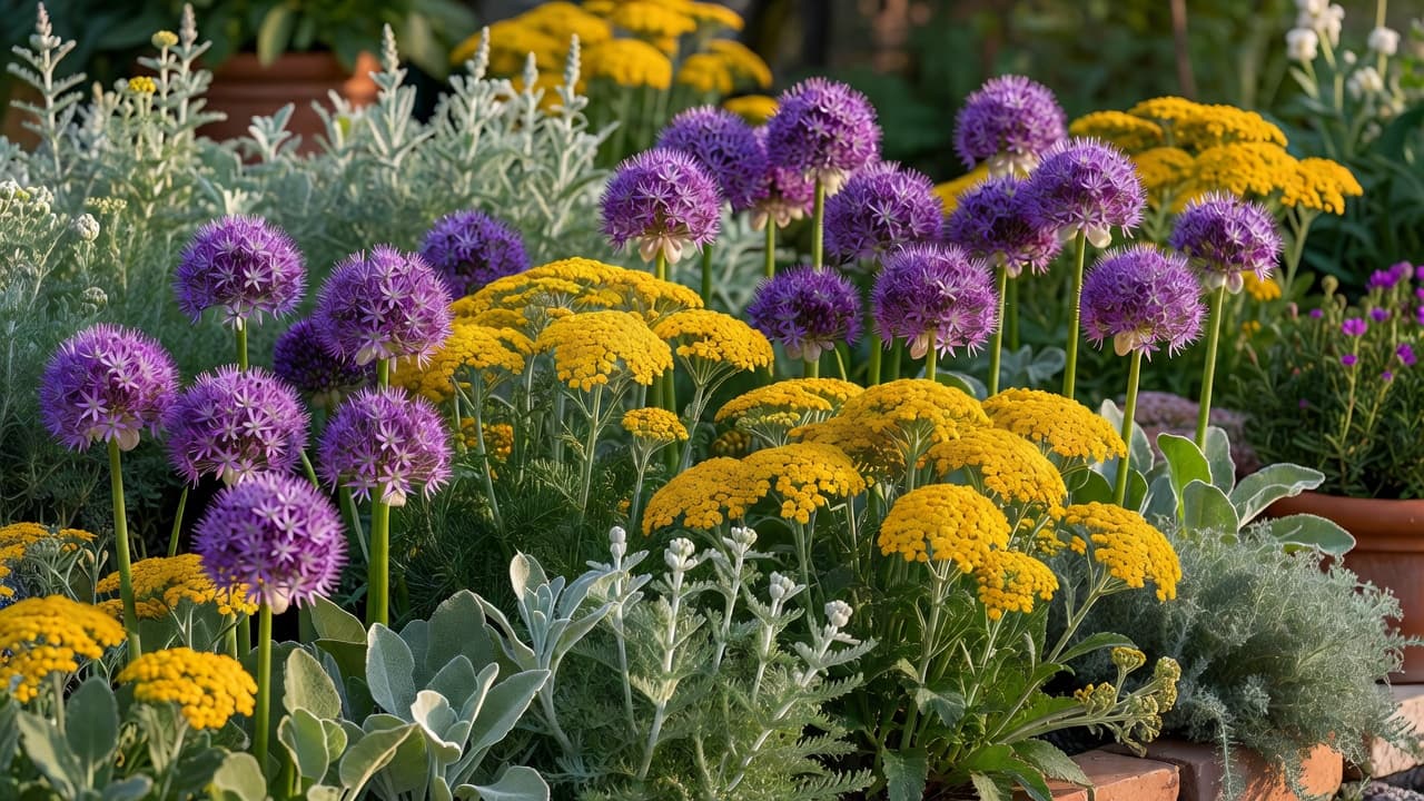
- Complementary — colours opposite each other on the wheel, which intensify one another. Purple Allium underplanted with gold Achillea, or blue Salvia against orange Geum, are both classic complementary pairings.
- Pastel — tints softened with white, which combine best with silver or grey foliage. Blush Astilbe, pale pink shrub roses and Artemisia ‘Powis Castle’ make a quiet pastel scheme.
- Triadic — three colours evenly spaced on the wheel, such as purple, orange and green foliage. It carries more energy than a two-colour complementary pairing but stays more controlled than an unplanned riot of colour.
Seasonal colour planning: one palette across four seasons
A colour scheme that only works in July leaves a garden flat for the other nine months. Planning in seasonal layers keeps the same palette recognisable from spring to winter, even though the plants doing the work keep changing.
- Spring — bulbs carry the palette before perennials wake up: white or purple Narcissus and Tulipa can echo the scheme to come.
- Summer — perennials take over: the warm or cool border established above reaches its peak from June to August.
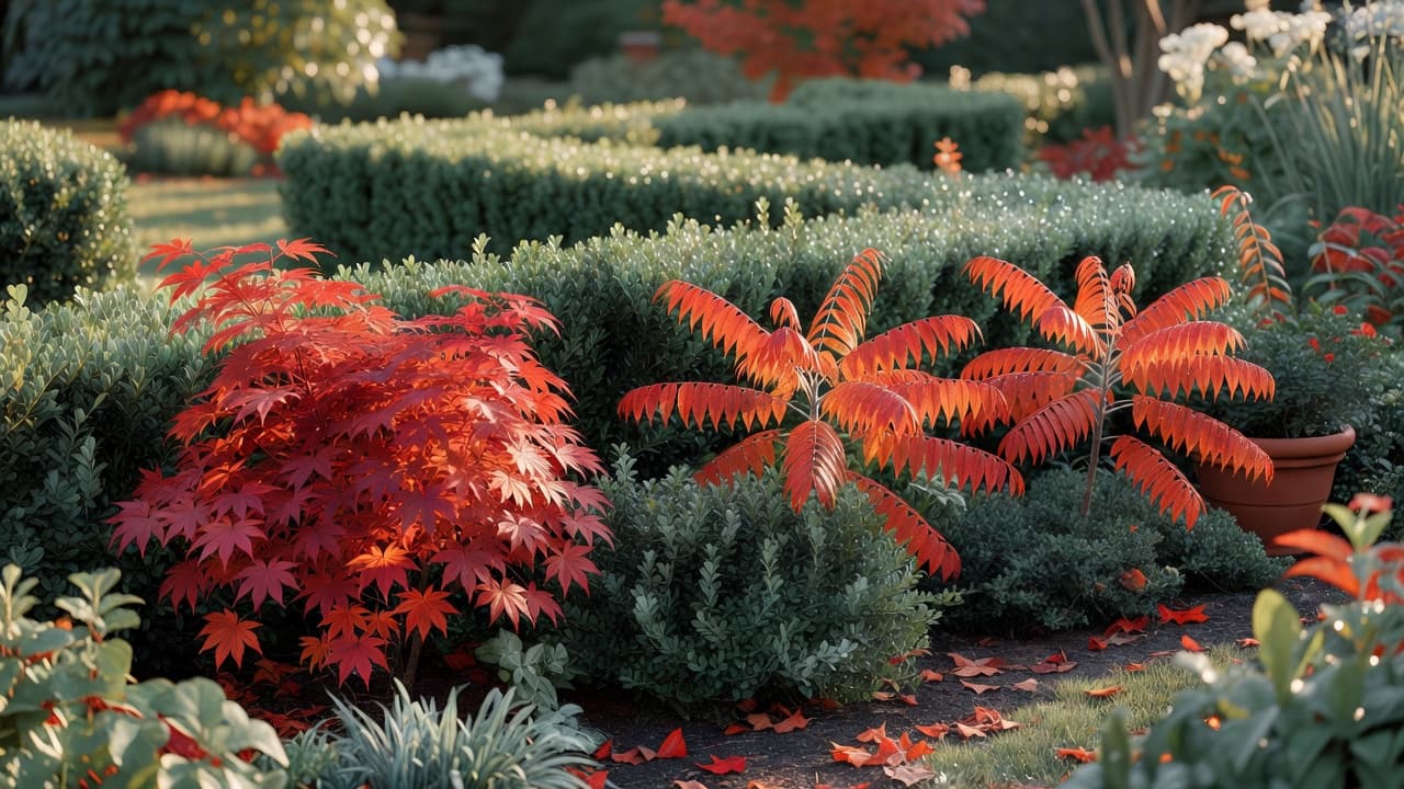
- Autumn — foliage colour extends the palette after flowers fade: Acer palmatum turns fiery red, and Rhus typhina (staghorn sumac) turns orange-red, echoing a warm summer scheme.
- Winter — structure and stems carry colour when almost nothing is in flower: Cornus alba ‘Sibirica’ has bright red winter stems, and evergreen Buxus or Taxus hedging keeps a green backbone year-round.
The University of Georgia Extension notes that seasonal colour needs the same planning as a summer border — a purple spring bulb planted next to a shrub that turns fiery orange in autumn will clash for a few weeks every year, so it is worth sketching what is in colour each season before planting.
Foliage colour: the quiet backbone that carries a scheme when nothing is in flower
Flowers get the attention, but foliage does most of the work in a colour scheme, because it is there for months at a time rather than weeks. A border built mostly from green foliage, with flower colour used as an accent, almost always reads as more considered than one planted for flower colour alone.
- Use evergreen structure — Buxus (box) or Taxus (yew) — as a calm green base that holds the scheme together in every season.
- Add coloured foliage as a supporting accent rather than the main event: Heuchera in amber or burgundy, or blue-green Hosta leaves.
- Variegated foliage — leaves with two or more colours, such as cream-edged Euonymus — behaves like its own mini colour scheme and should follow the same pairing rules as flowers.
This is the same principle used in garden styling — a single repeated thread, in this case a foliage colour, ties a space together far more effectively than lots of unrelated colours used once each.
Common colour theory mistakes in the garden
- Using every colour once instead of repeating two or three — repetition, not variety, is what makes a scheme read as intentional.
- Ignoring how light changes colour: bright, full sun bleaches pastels and dark tones, while shade intensifies cool colours and can make warm colours look dull.
- Forgetting the backdrop — a red-brick house or a dark fence changes how every planted colour reads against it.
- Planning only for summer and leaving spring, autumn and winter without any colour plan at all.
- Never checking the view from the kitchen or living room window — indoors is the angle a colour scheme is seen from most often.
How to test a colour palette before you plant anything
Professional designers test a palette before committing a single plant to the ground, and there is no reason a home gardener cannot do the same. A handful of coloured pots, fabric swatches or paint cards held against the existing planting will quickly show whether a proposed scheme clashes with a fence, a patio or the house itself.
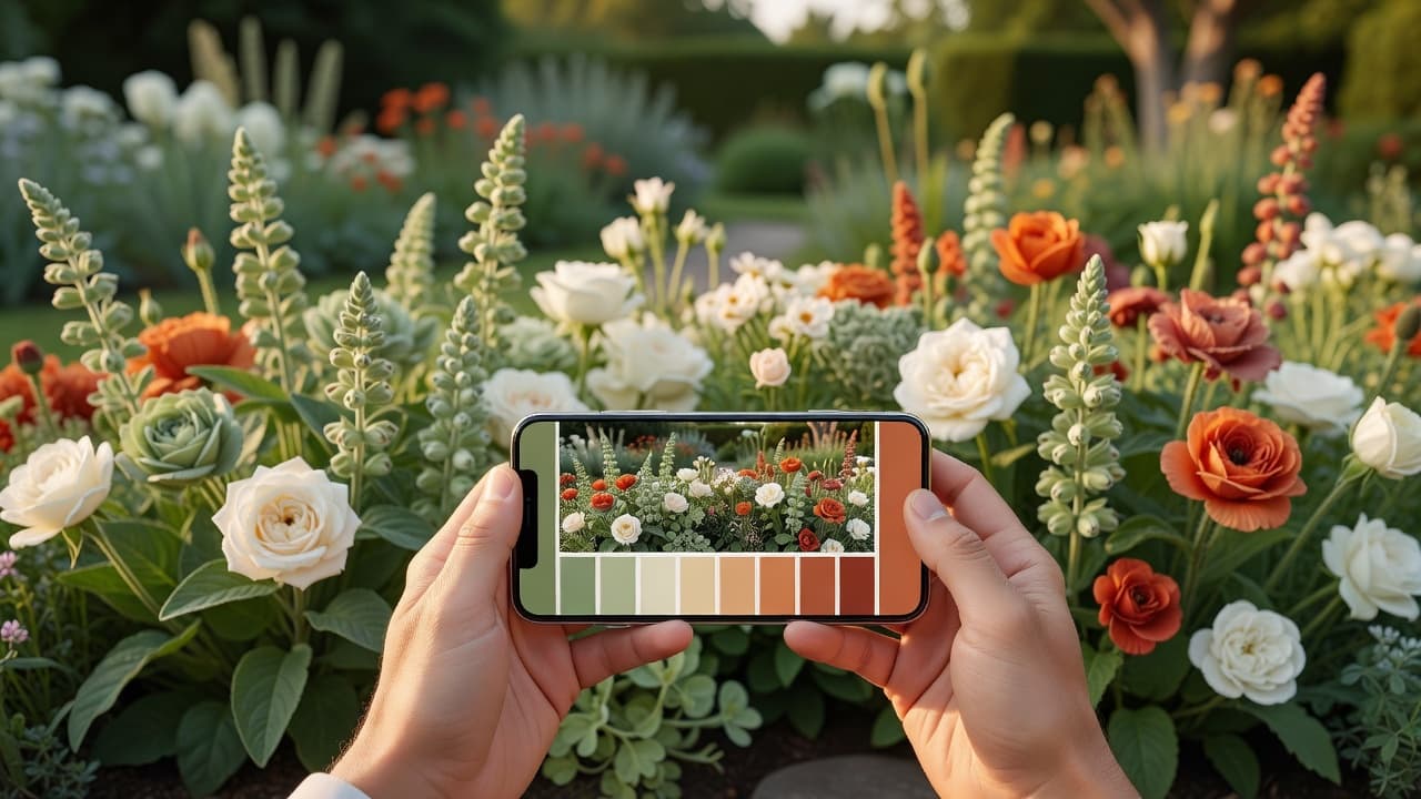
An AI garden design app such as FlorAI adds a faster version of the same test: upload one photo of your own garden, choose a colour direction — a hot border, a cool blue-and-white scheme, a monochromatic white garden — and see a photo-realistic preview of that palette on your real space in seconds, before buying a single plant. It is the same logic covered in our wider AI garden design guide and our plain-English explainer of what AI garden design is, applied specifically to colour.
If the palette involves any structural change — a new border shape, a change of paving colour, a retaining wall — it is worth checking real costs first in our 2026 garden redesign cost guide before committing to a full replant.
Frequently asked questions about colour theory for garden design
What is colour theory in garden design?
Colour theory in garden design is the practice of choosing plant and material colours by their position on the colour wheel — using colours that sit next to each other (analogous), opposite each other (complementary), or at different values of one colour (monochromatic) — so a planting scheme reads as considered rather than random.
What colours make a small garden look bigger?
Cool colours — blue, white, silver and pale green — visually recede, so planting them at the far end of a small garden creates a sense of depth and makes the space feel larger. Warm colours such as red, orange and gold visually advance and work better near the house or seating area.
What is the best colour scheme for a flower border?
There is no single best scheme — an analogous scheme of yellow, orange and red is a reliable, low-risk choice for a warm, cohesive border, while a complementary scheme such as purple and gold gives more contrast and energy. Both work because they follow the colour wheel rather than mixing colours at random.
How many colours should be in a garden colour scheme?
Two to three colours, repeated several times across the space, generally reads better than five or six colours used once each. Repetition, not variety, is what makes a colour scheme look planned.
Can an AI garden design app help with colour planning?
Yes. An app such as FlorAI can generate a photo-realistic preview of a chosen colour scheme — warm, cool or monochromatic — applied to a photo of your own garden in seconds, which makes it easy to test a palette before buying any plants.
Do I need to match my garden colours to my house?
It helps to consider it. A red-brick house sits comfortably next to a warm or complementary green-and-gold scheme, while a white or grey-rendered house gives more freedom, including cooler blue, white and silver palettes.
Last updated: July 2026. Written by the FlorAI garden team.